The crossplatform email game has gotten a lot easier in the past five years: the main platforms to target are iOS and Android. Everyone else gets the same content.
There are a couple old articles about HTML email on this site. They’re obsolete, but you might skim them for context:
Creating Email Messages with Clickable Links that Add Events to Your Calendar
The “Impossible” Dream: Formatting Email So It Looks the Same on All the Clients and Browsers
Today, crossplatform mobile email embodies a few basic rules of thumb:
- Use the H1 and H2 tags to make headings.
- Use P to make the body text, but use SHIFT-ENTER to force BR spacing between paragraphs.
- Use CSS to style them, but not too much.
- Use images that aren’t too big, like 500px across. If you want to go large, use CSS to fit them to the mobile screen.
- Small icons need to be large on the mobile screen, because we’re using our fat fingers to touch them.
Mobile puts a ton of constraints on font sizes and layouts. Basically, you need to have a large font because people may be reading outdoors. So you need to stop specifying the font size, so the email’s browser defaults can take precedence.
Likewise, you can’t really do two-column layouts in a tiny screen. Everything is one-column, and the headings end up looking better centered. If you’re using a layout based on TABLE tags, stop.
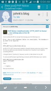
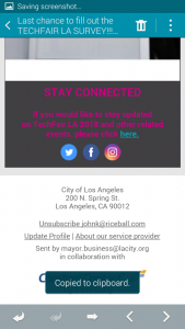
I’m attaching some examples of emails in the Samsung version of Mail and iPhone’s Mail. Some comments, but most of the criticisms above cover it.
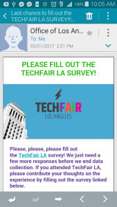
The orange button is good and readable.

The red on gray is too low-contrast.
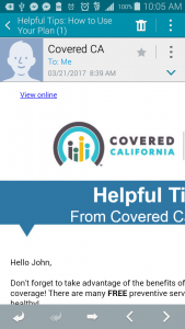
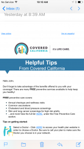
This Obamacare email is okay, except for the speech bubble.
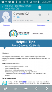
Yikes. I will head to the desktop to read this email.
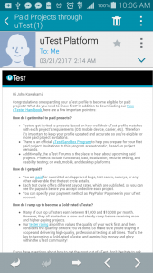

This email doesn’t work. It’s too small to read when you’re zoomed out, and you need to scroll when you’re zoomed in.


iOS looks a little better, because the default text size is a little larger. I may just have a too-small screen on my Android phone.
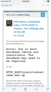
WordPress looks better on iOS Mail.
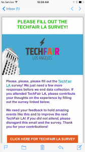


The problem with the above is the same as it was on Android.
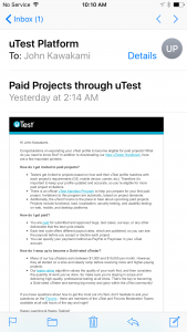
Again, back to the desktop to read this when I can have more time.